Do you write for the tech-heads who obsess over every details? The broader public who may only upgrade their phone every few years? Sceptics? Fans? There’s simply no right way. Making this even trickier is the fact the devices are now incredibly mature. This year’s model (the iPhone 13 in case you didn’t get that from the headline) continues a series of iterative upgrades that streamline the phone. In other words, you already kinda know what you’re gonna get with a new iPhone: something incredibly familiar that’s a bit better than what’s come before. The difficulties in being incisive are clear. But, friends, I’m not one to shirk a challenge. So, in the spirit of Not Letting The Man Get You Down, I’d like to introduce you to my way of reviewing the Apple iPhone 13: a series of haikus. If you’d like a series of stats about everything that’s new, you can find those details here and here. If you’d prefer to find a wordier (and more boring review), you’re in luck: there are hundreds of those out there. Instead though, we’re going the haiku route.
Why review the iPhone 13 with haikus?
Because they get straight to the point and are more fun than boring-ass prose.
What’s new with the iPhone 13 design?
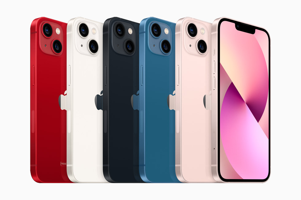
Bigger camera bump. Diagonal lenses and less notch. ‘New’ colors.
How is using the iPhone 13?
It feels delicious in my sweaty hands. Sleek and weighty. Beautiful.
What are the major updates users should care about?
Battery life and the cameras have gotten better — which is quite welcome.
And what about the battery life?
The iPhone 13 lasts for 2.5 hours longer than the 12.
But what does that actually mean?
The battery life is fantastic. It goes on and on and on and on.
What about the cameras?
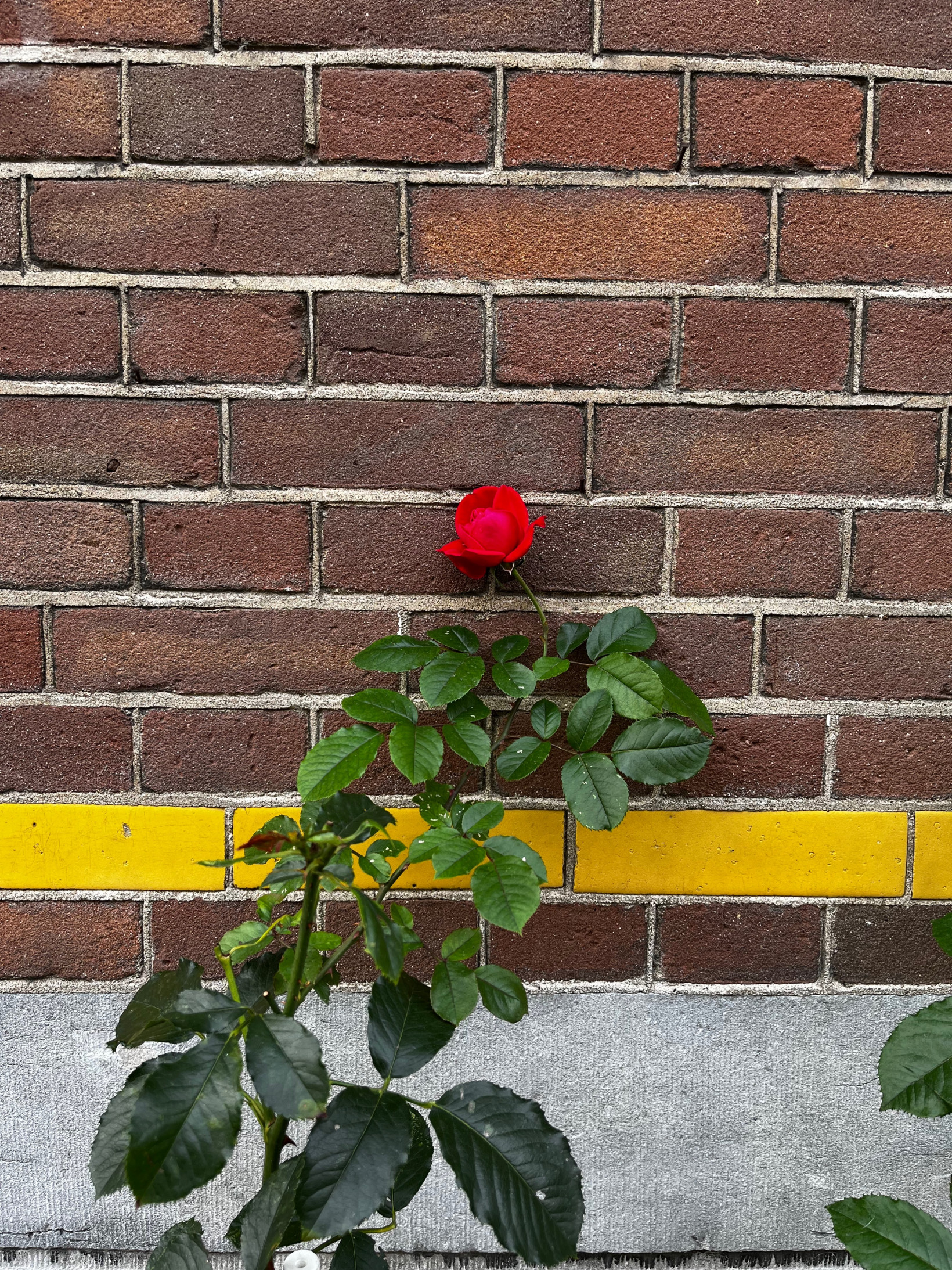
Akin to the 12, but Night Mode is much improved. Overall, badass.
The iPhone 13 sounds fantastic!
It is, but I still hate there’s no charger in the box. Ridiculous.
What are your final thoughts on the iPhone 13?
It is excellent. I would recommend it to almost anyone.


